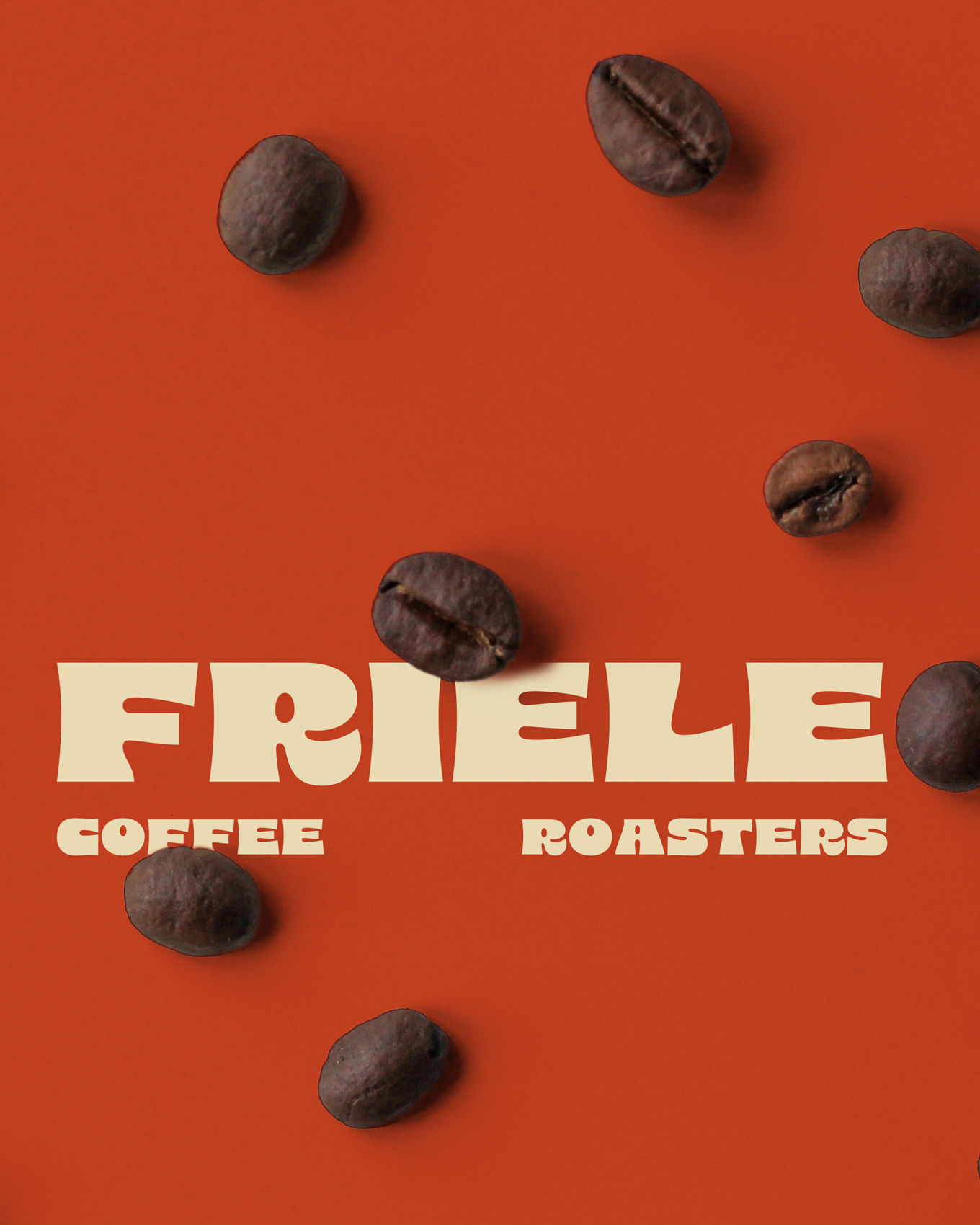
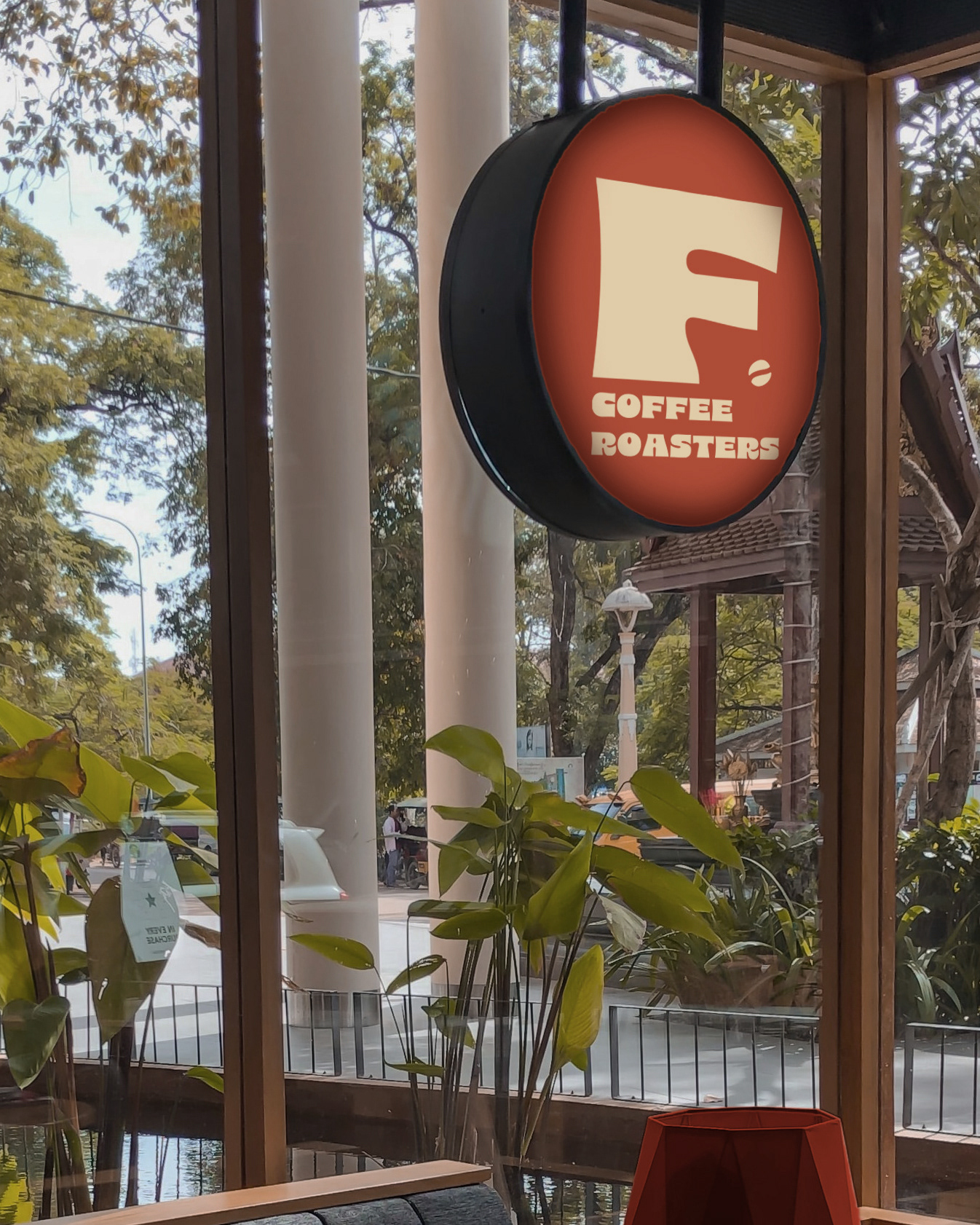
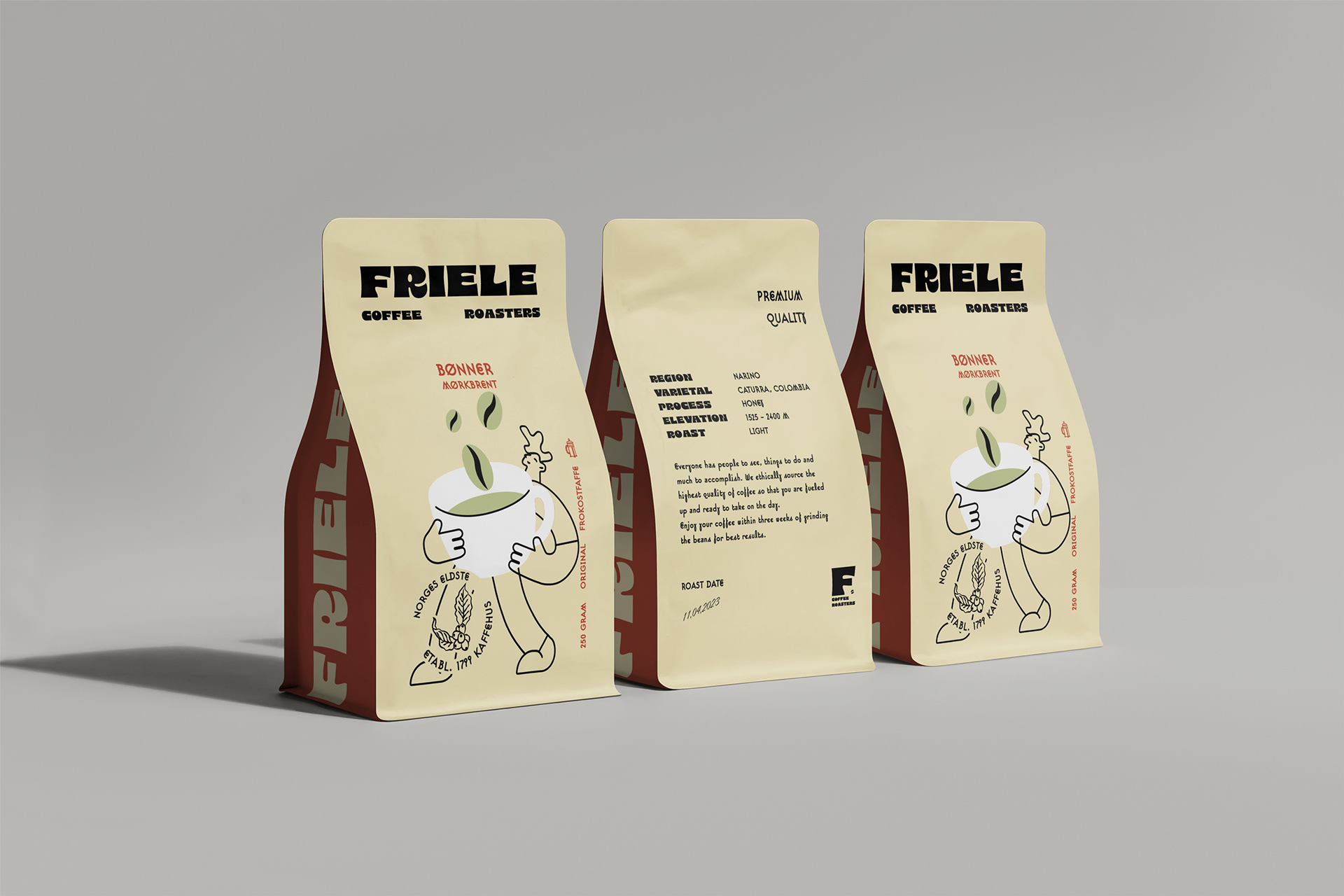
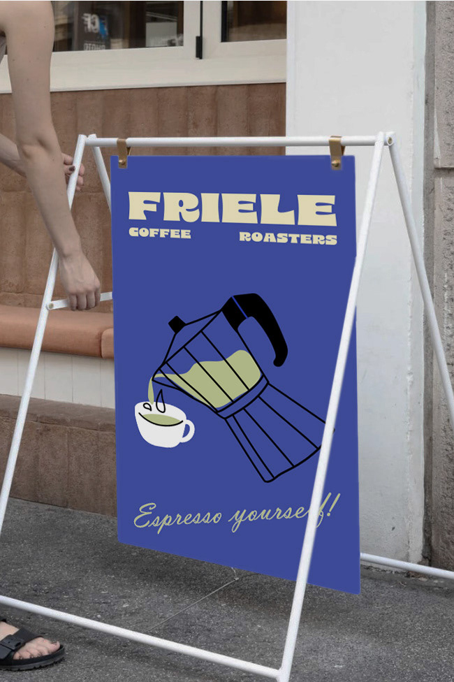
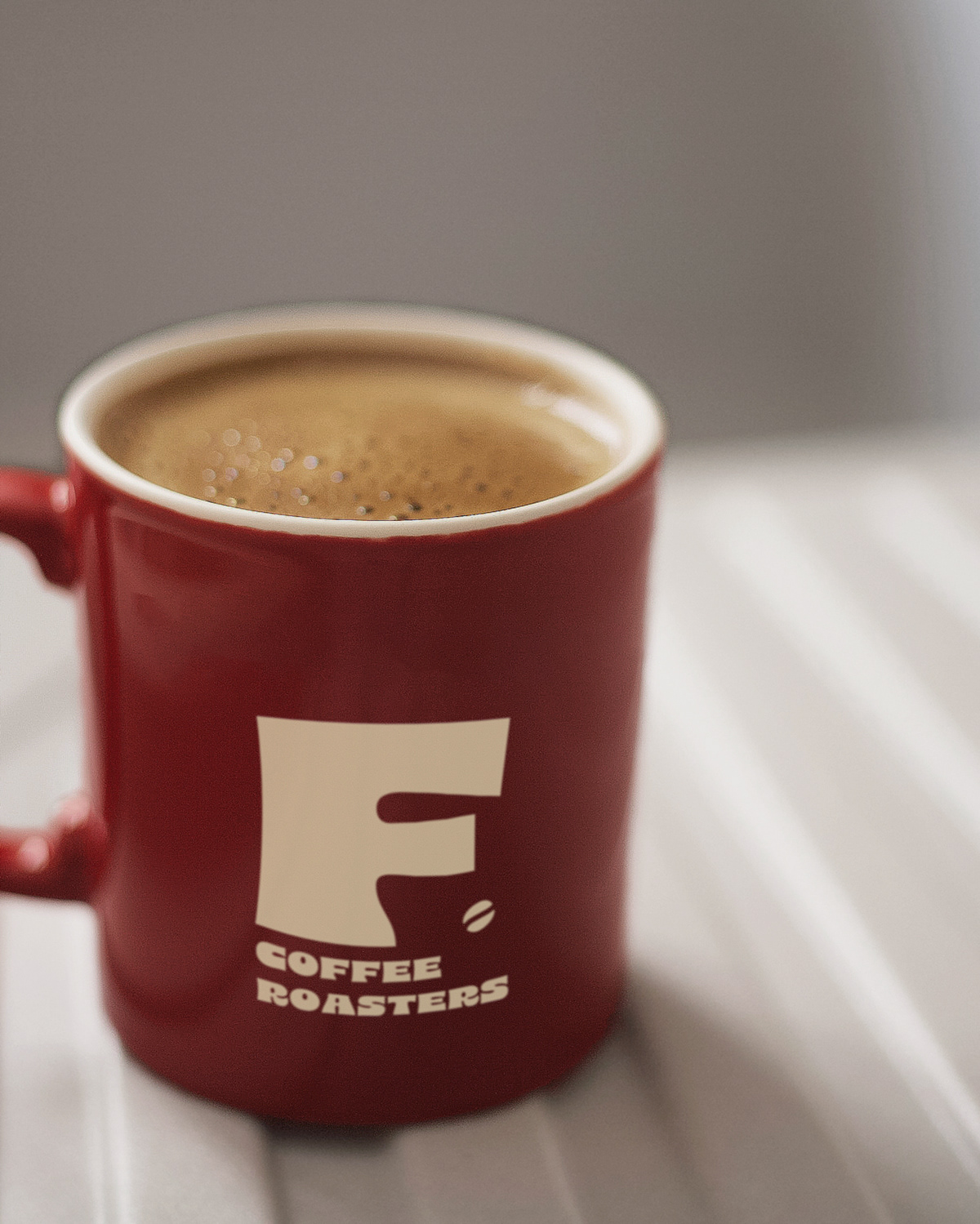
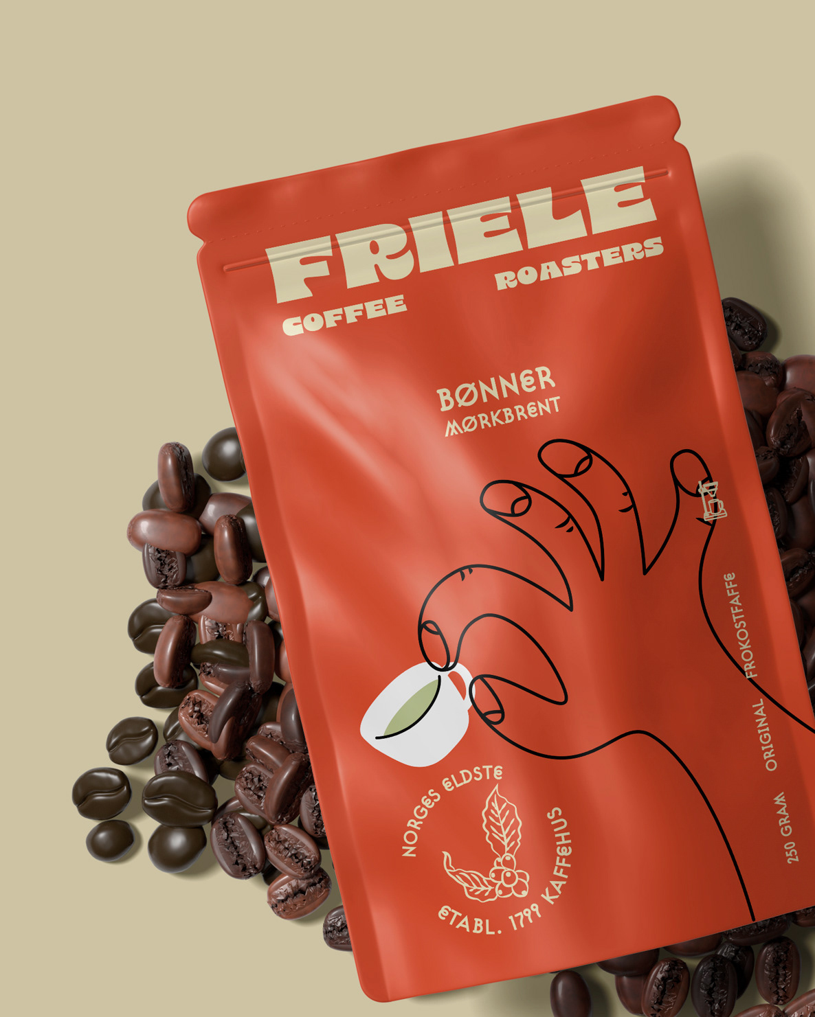
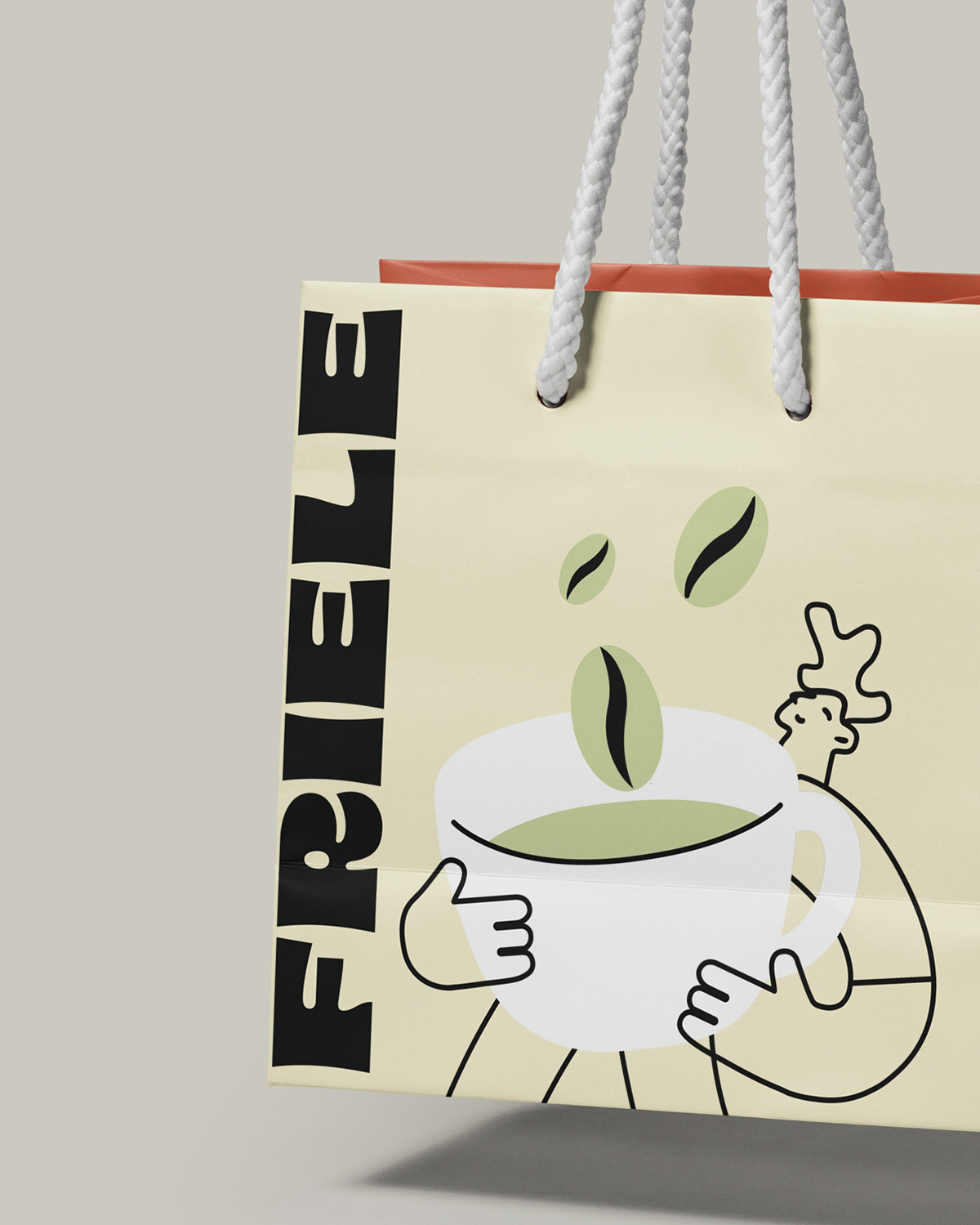
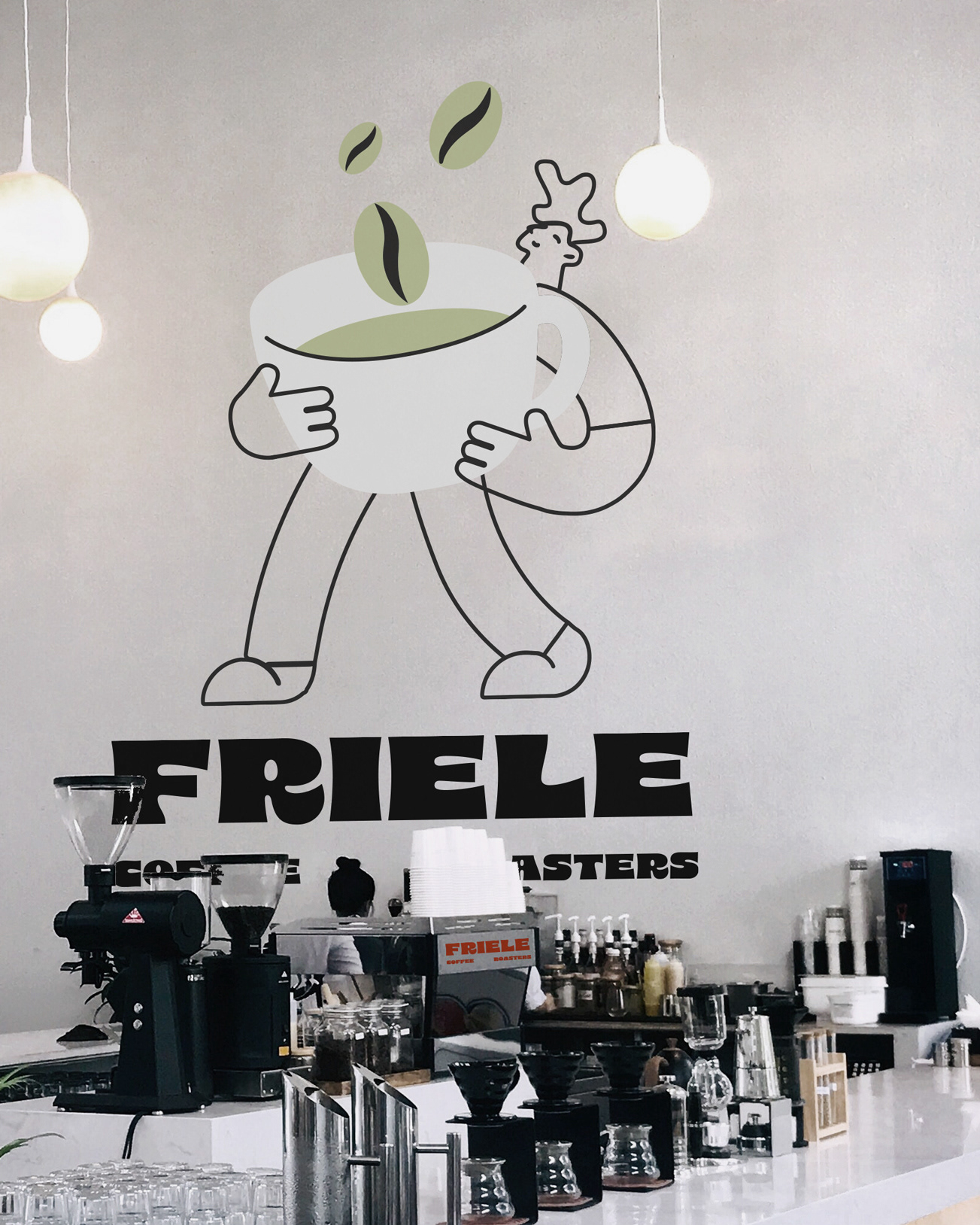
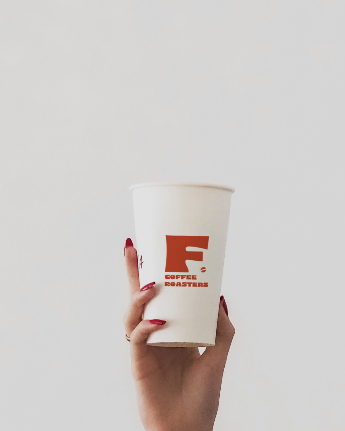
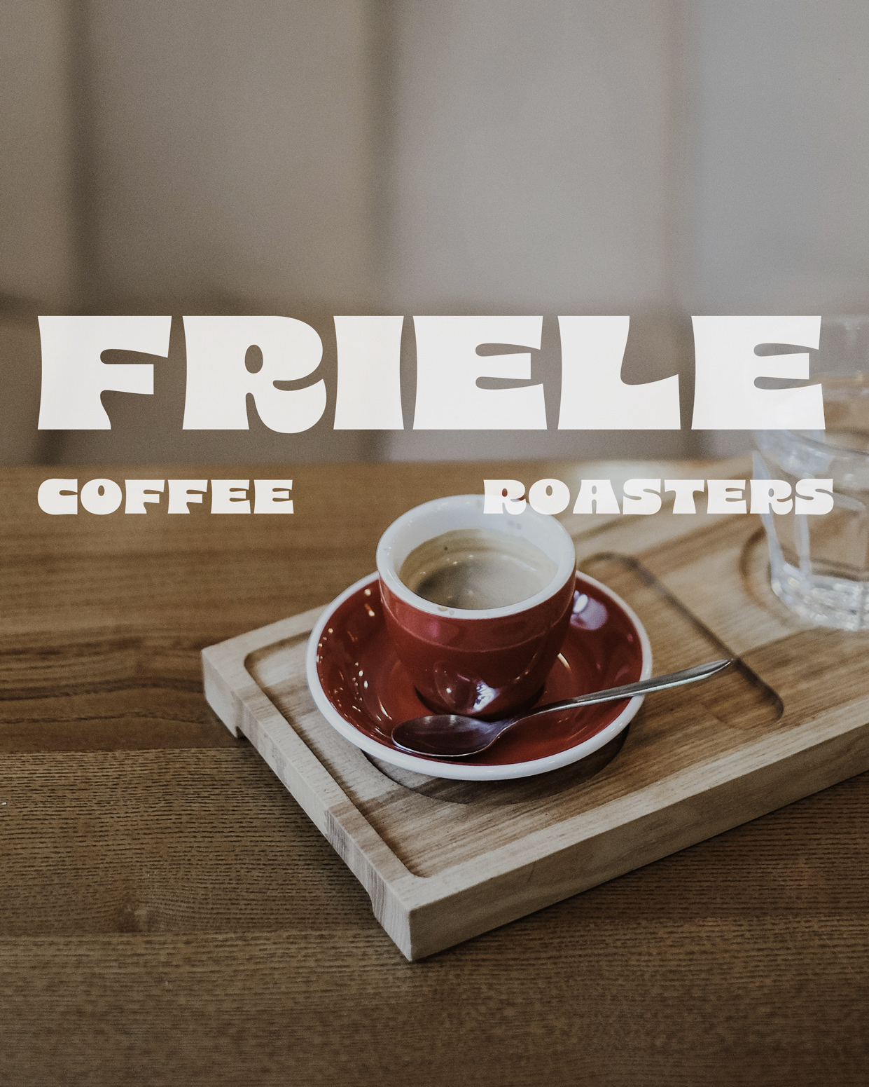
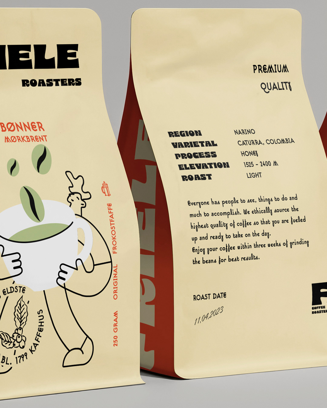
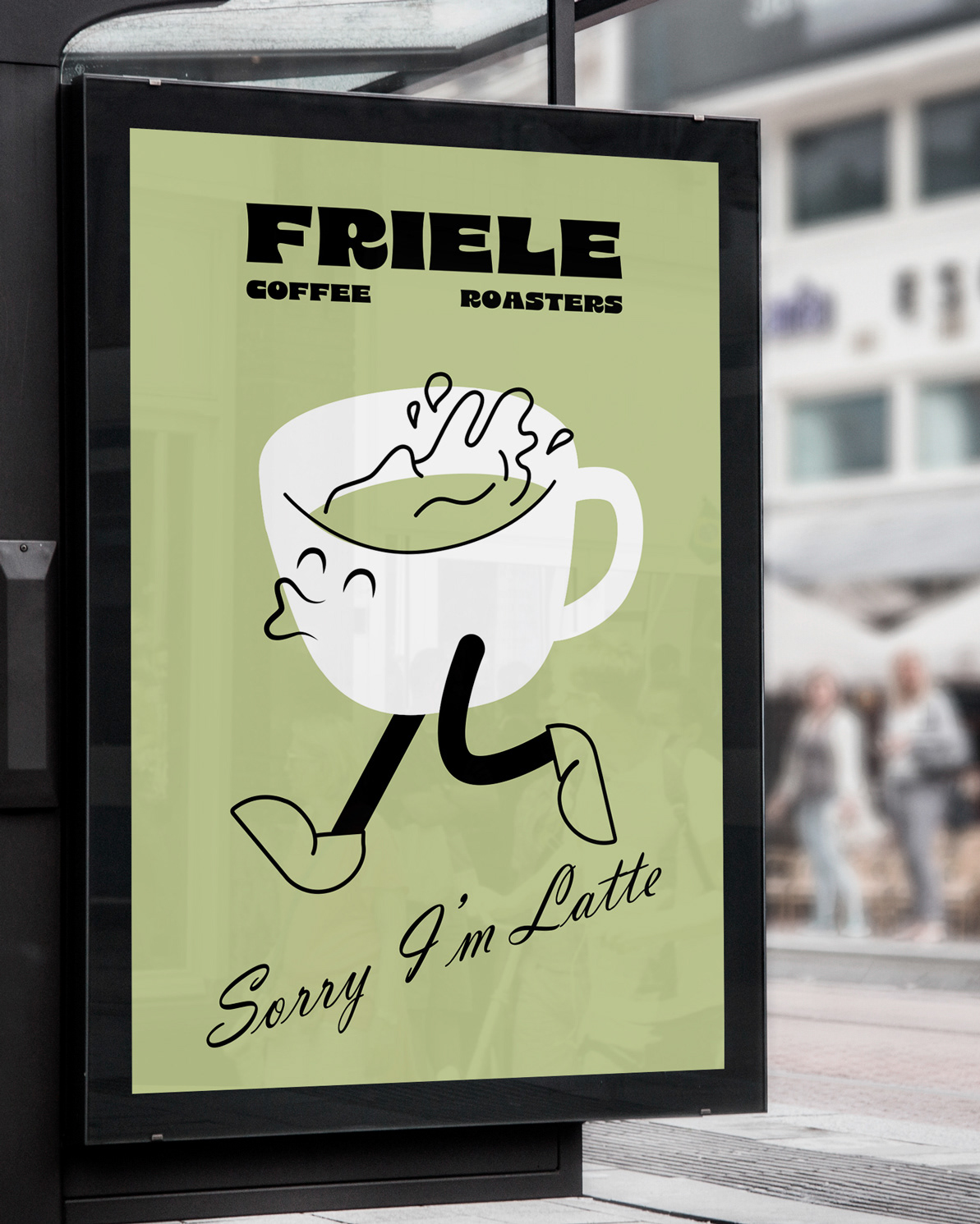
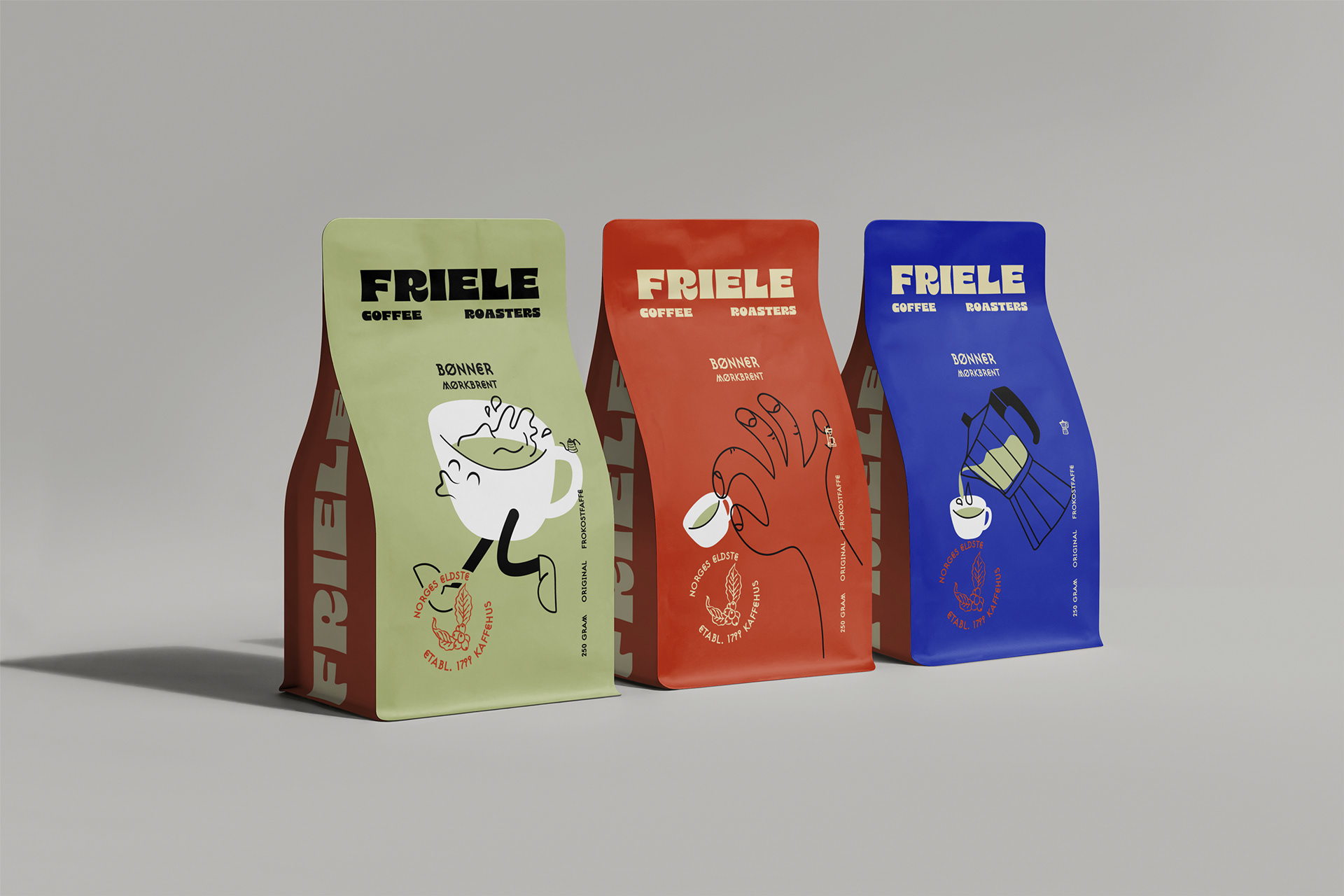
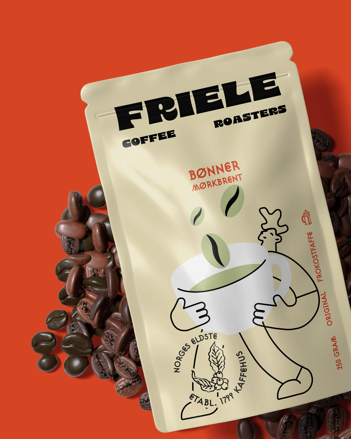
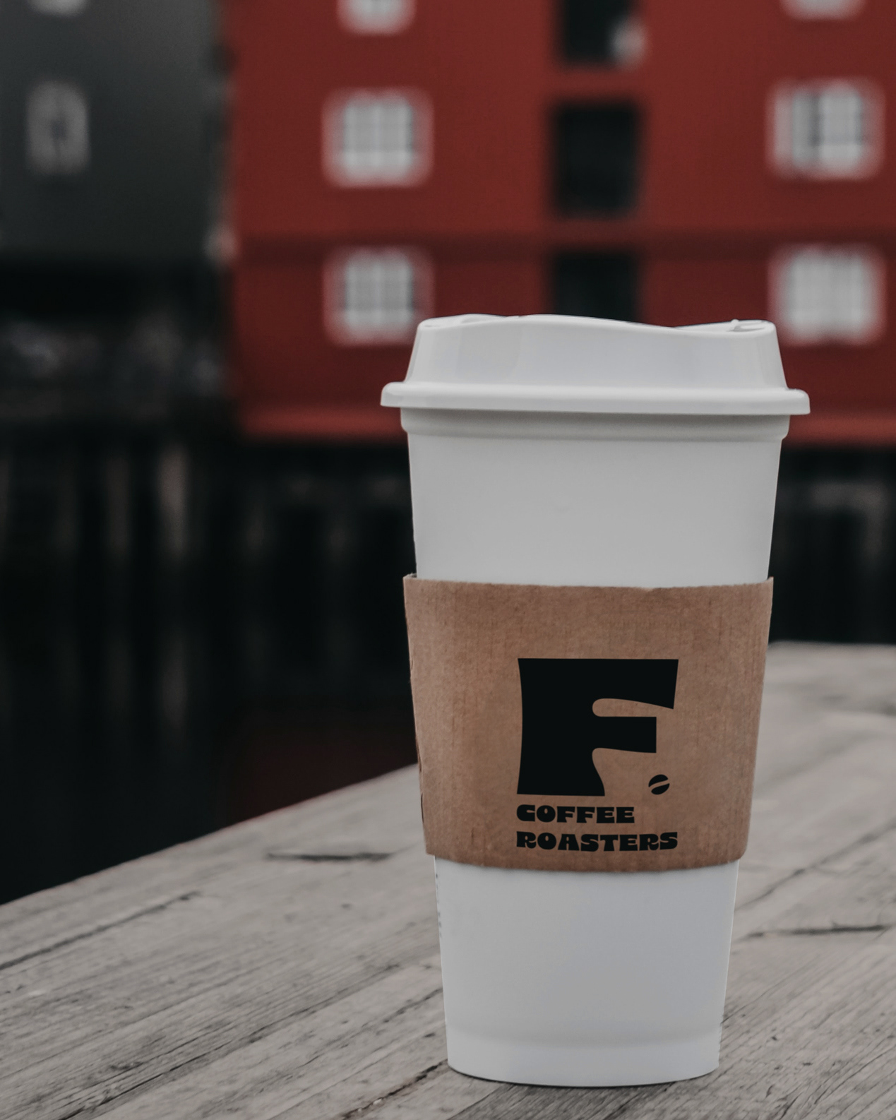
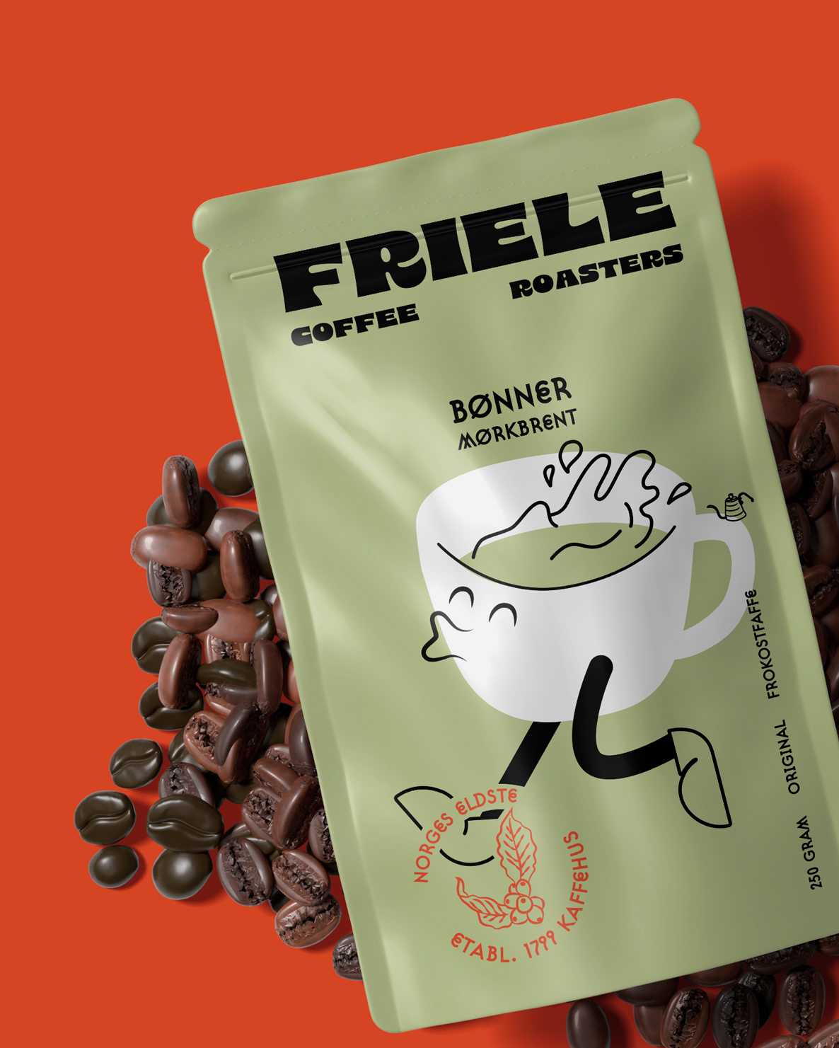
If Friele had a redesign of his branding: a new and fresh look that updated a classic red for scarlet red with orange notes. The type takes a turn from a stiff italic sans serif to a chunky and funky 8 Heavy, Suburban OT is complementing the weight as a secondary typography. A set of joyful graphic elements complet the branding and assembles the packaging for each variety of coffee.