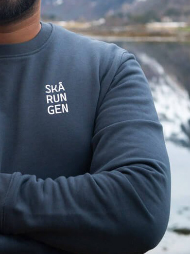
"Where wilderness meets elegance"
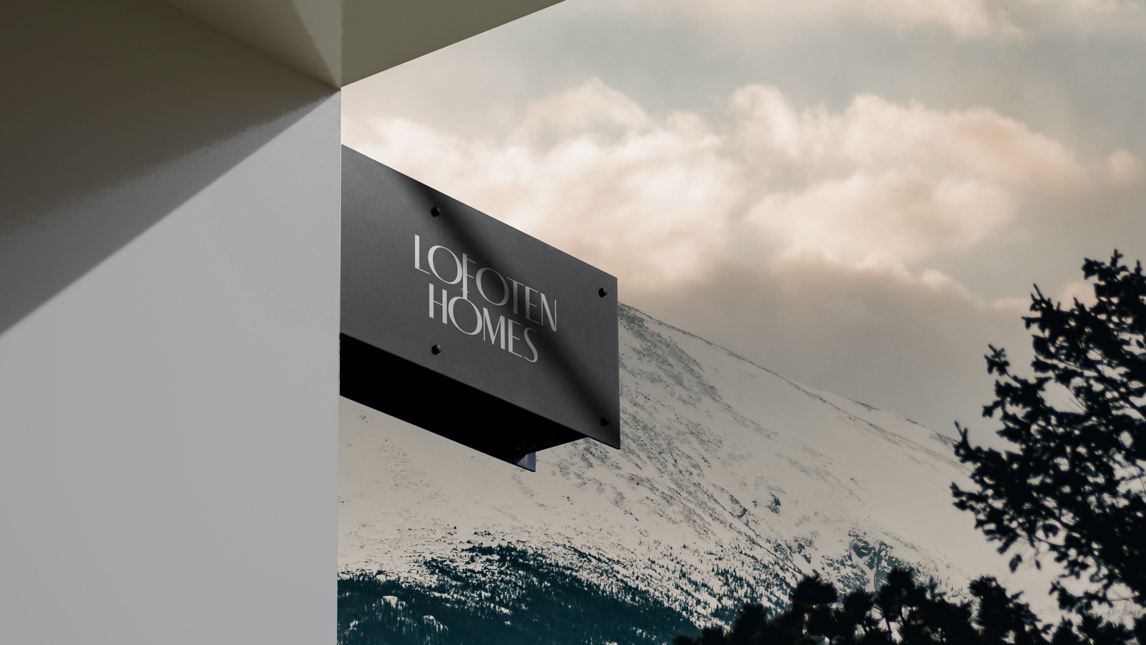
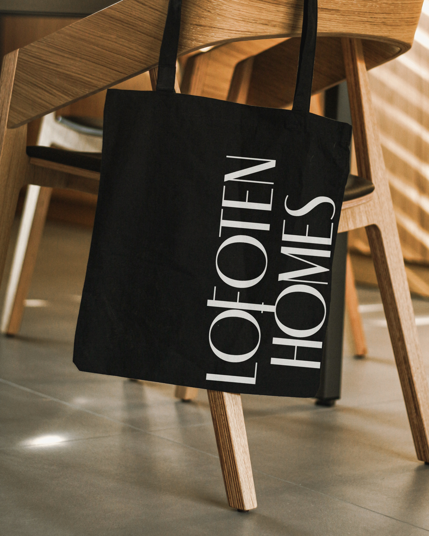
Branding for Lofoten Homes, an exclusive retreat in the heart of the breathtaking arctic islands, where luxury meets untamed nature. Graphic identity that embodies the essence of natural luxury and tranquility, a visual identity carefully crafted that seamlessly integrates a cohesive and captivating brand experience.
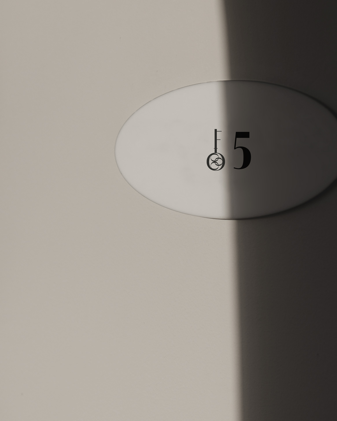
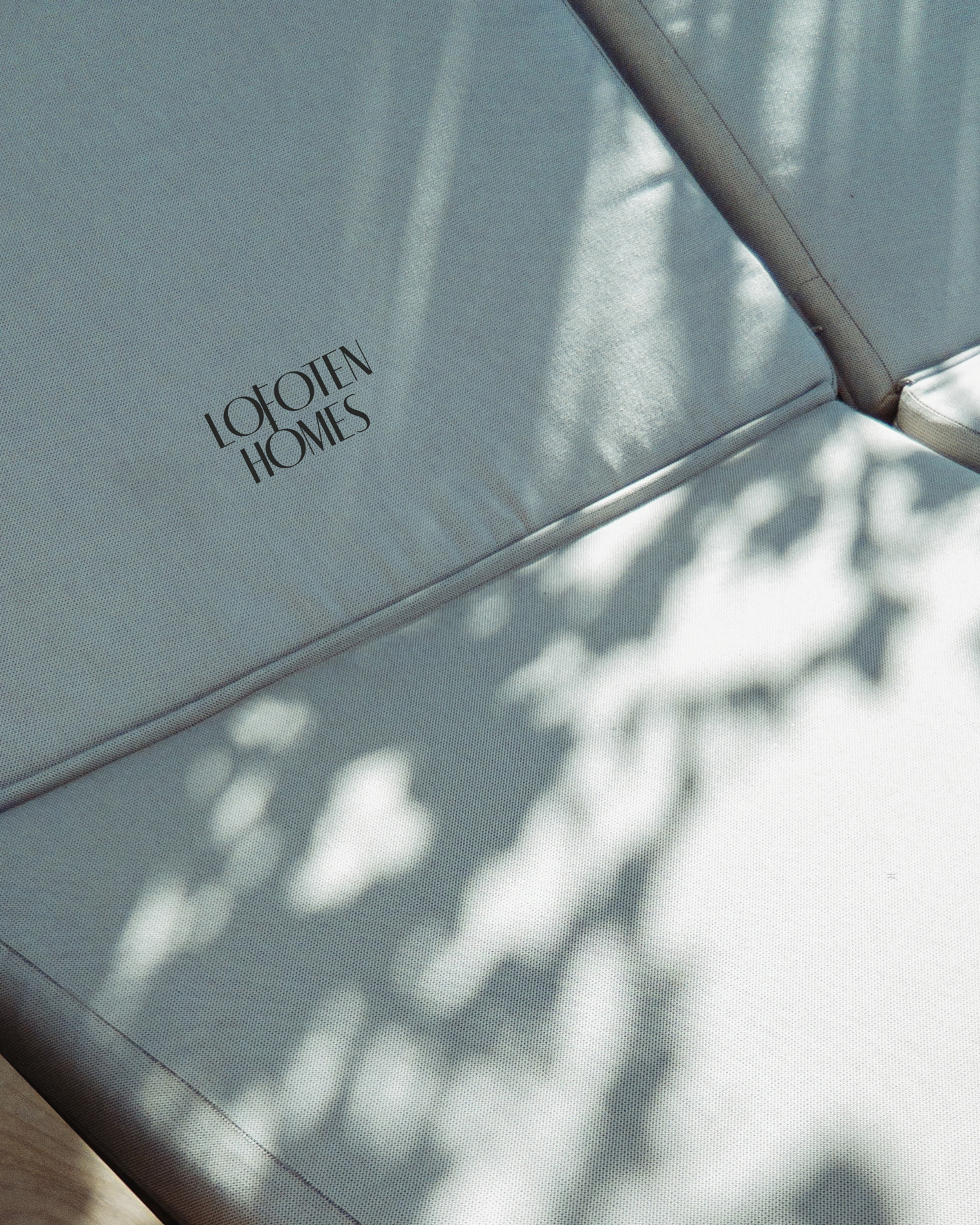
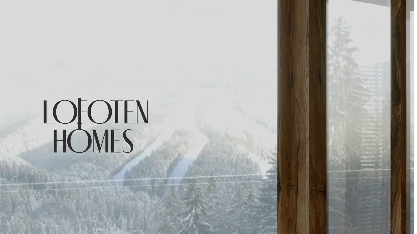
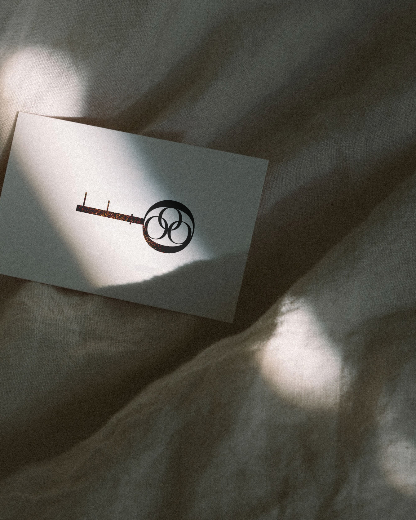
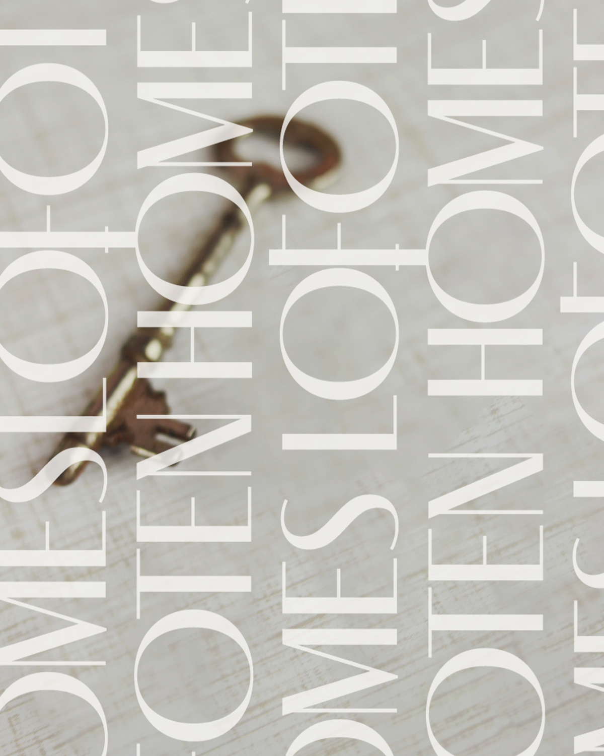
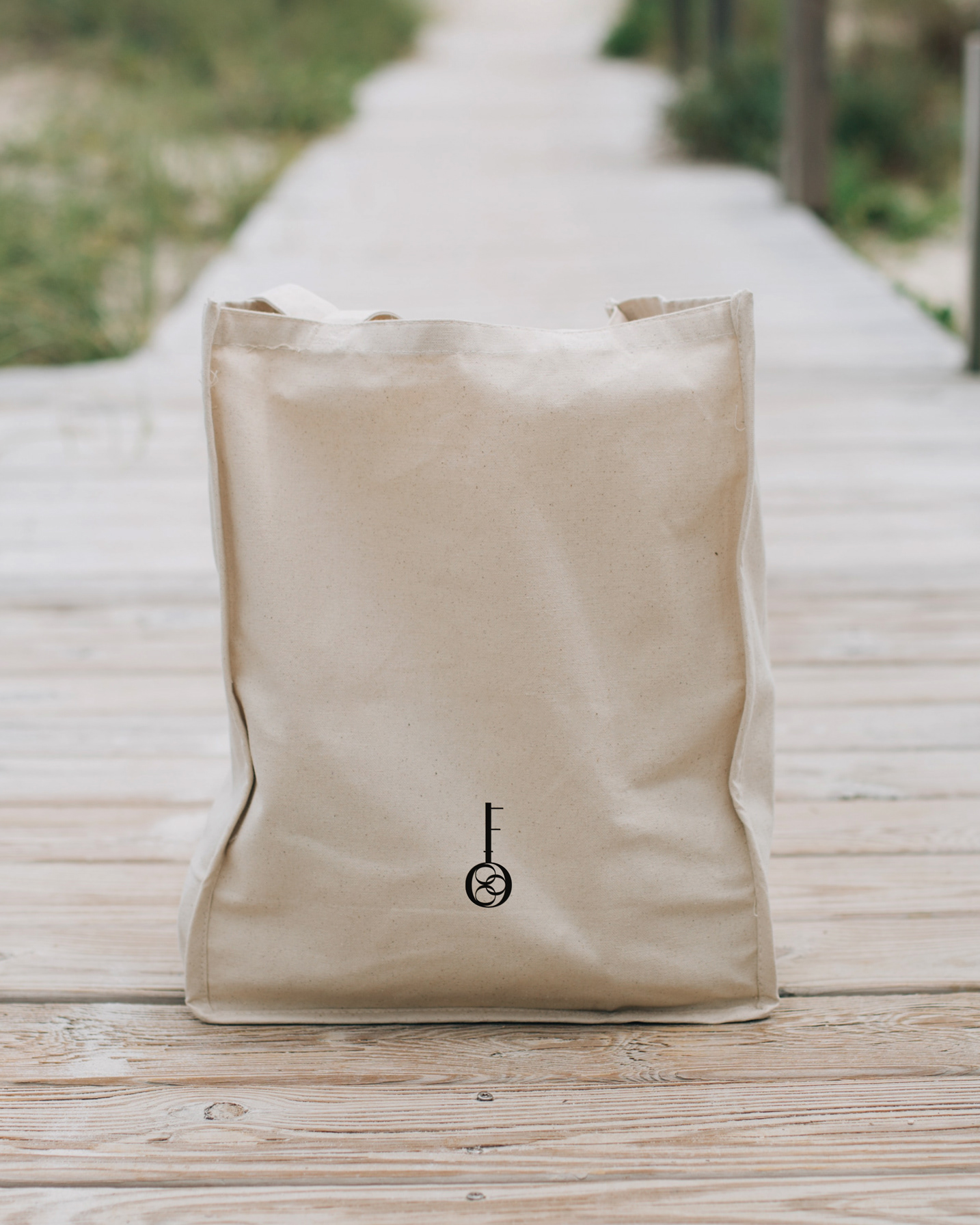
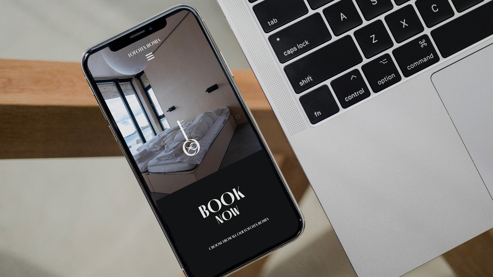
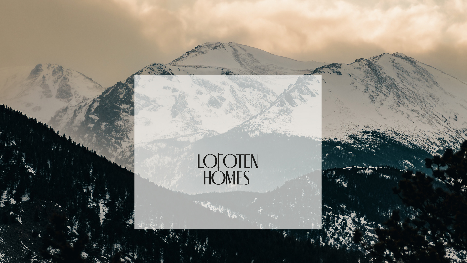
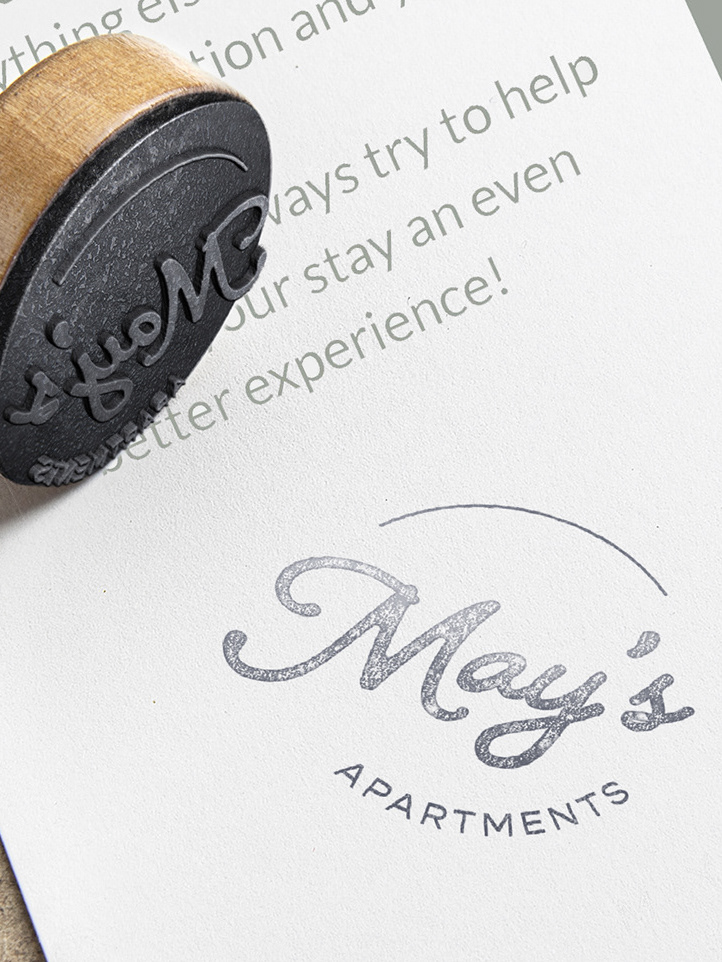
The logo for this exclusive accommodation is meticulously designed to encapsulate the essence of its nature and surroundings. Fino Sans typography by Ermin Međedović from TypeTogether takes center stage, providing a modern and elegant typographic foundation that harmonizes with the omnipresent wood texture within the buildings and the nordic pine trees. Complementing this, a secondary logo introduces a key-shaped icon, symbolizing exclusivity and unlocking the extraordinary experiences awaiting discerning guests. A shape that has been developed from the primary logo lettering, as a refined graphic version of it. Together, these elements form a cohesive visual narrative, inviting viewers to envision the intersection of sophistication and coziness.