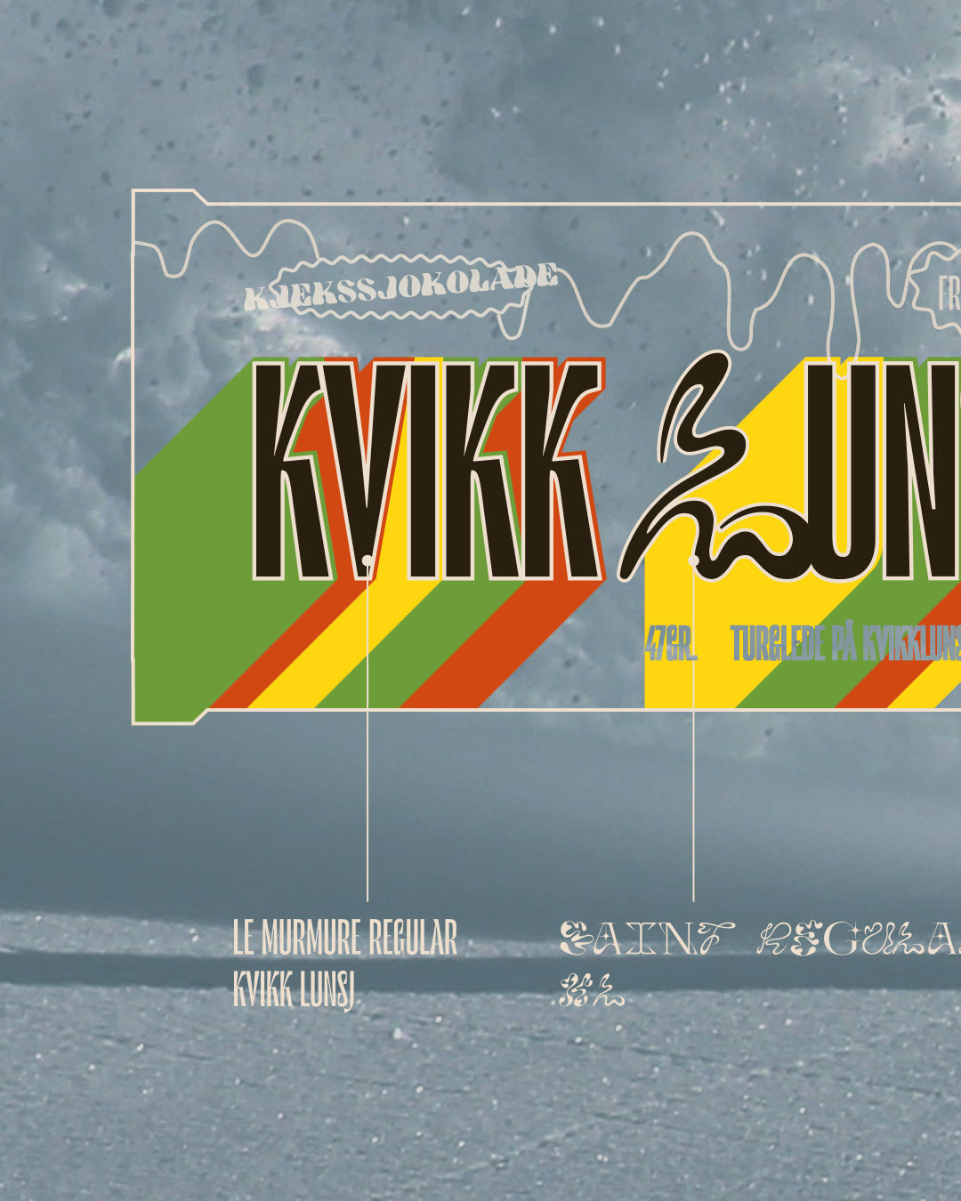
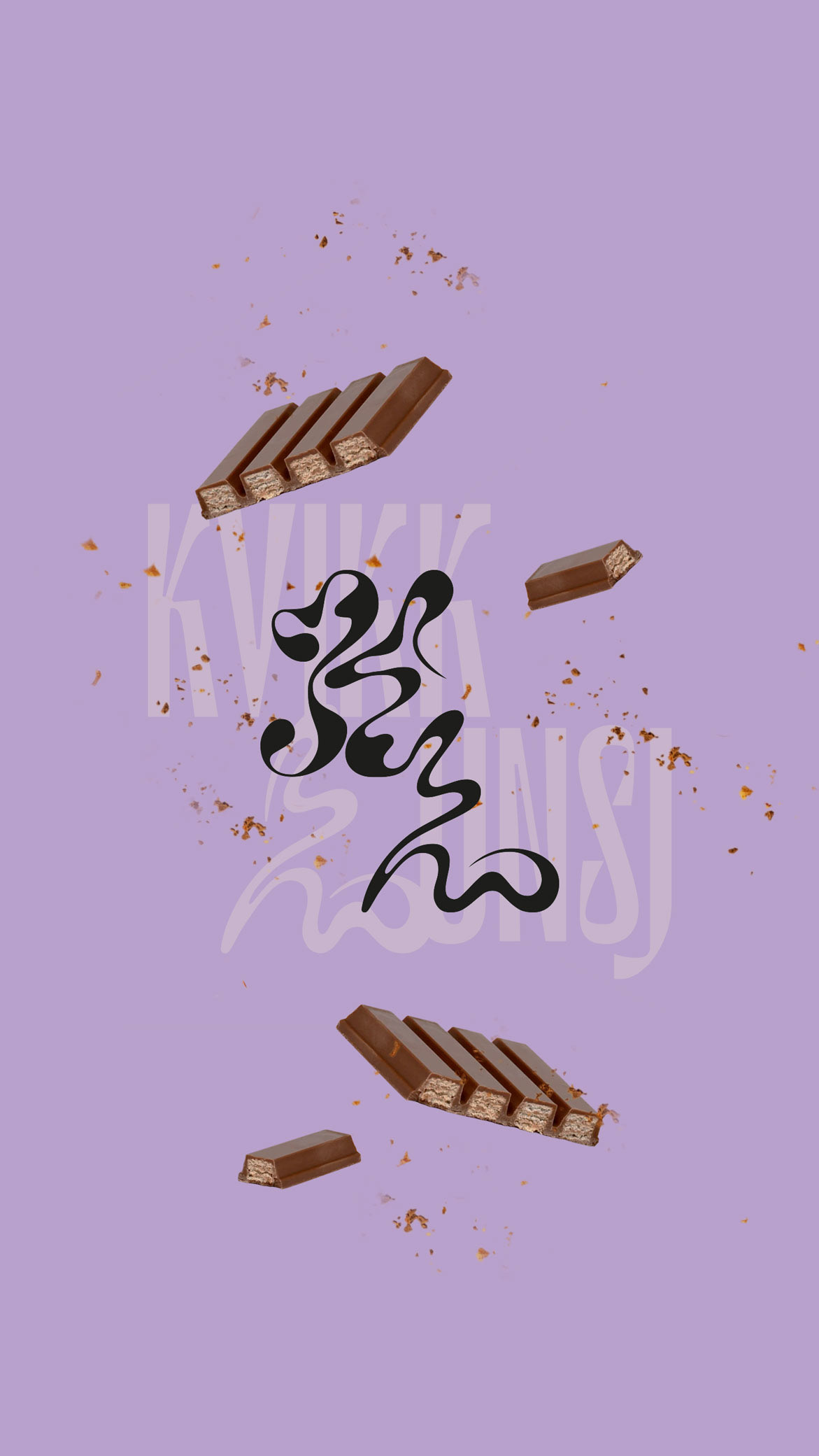
If Kvikk Lunsj had a groovy redesign of his branding for the iconic Norwegian chocolate snack, I sought to capture the essence of its traditional roots while infusing a vibrant energy synonymous with the outdoors. Renowned as the go-to treat for nature adventures, the reimagined brand narrative revolves around the concept of a quick break to snack and recharge amidst the wilderness.
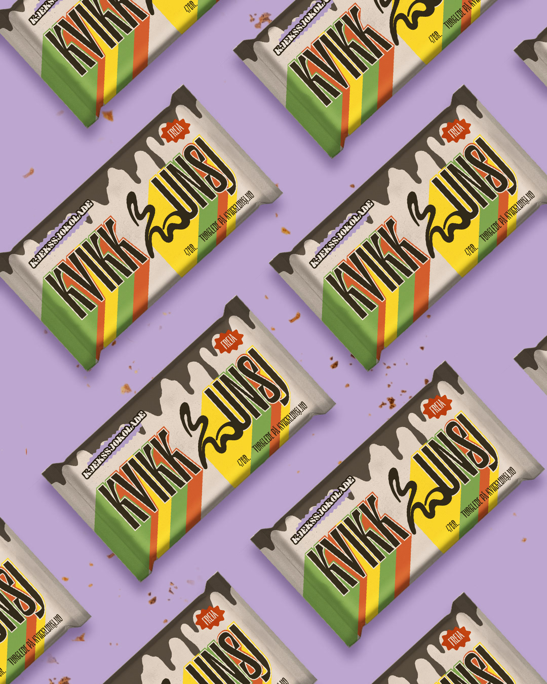
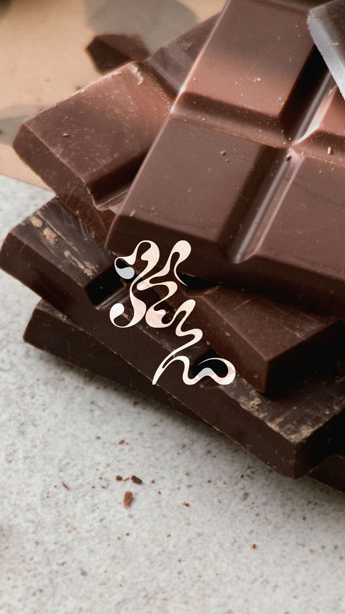
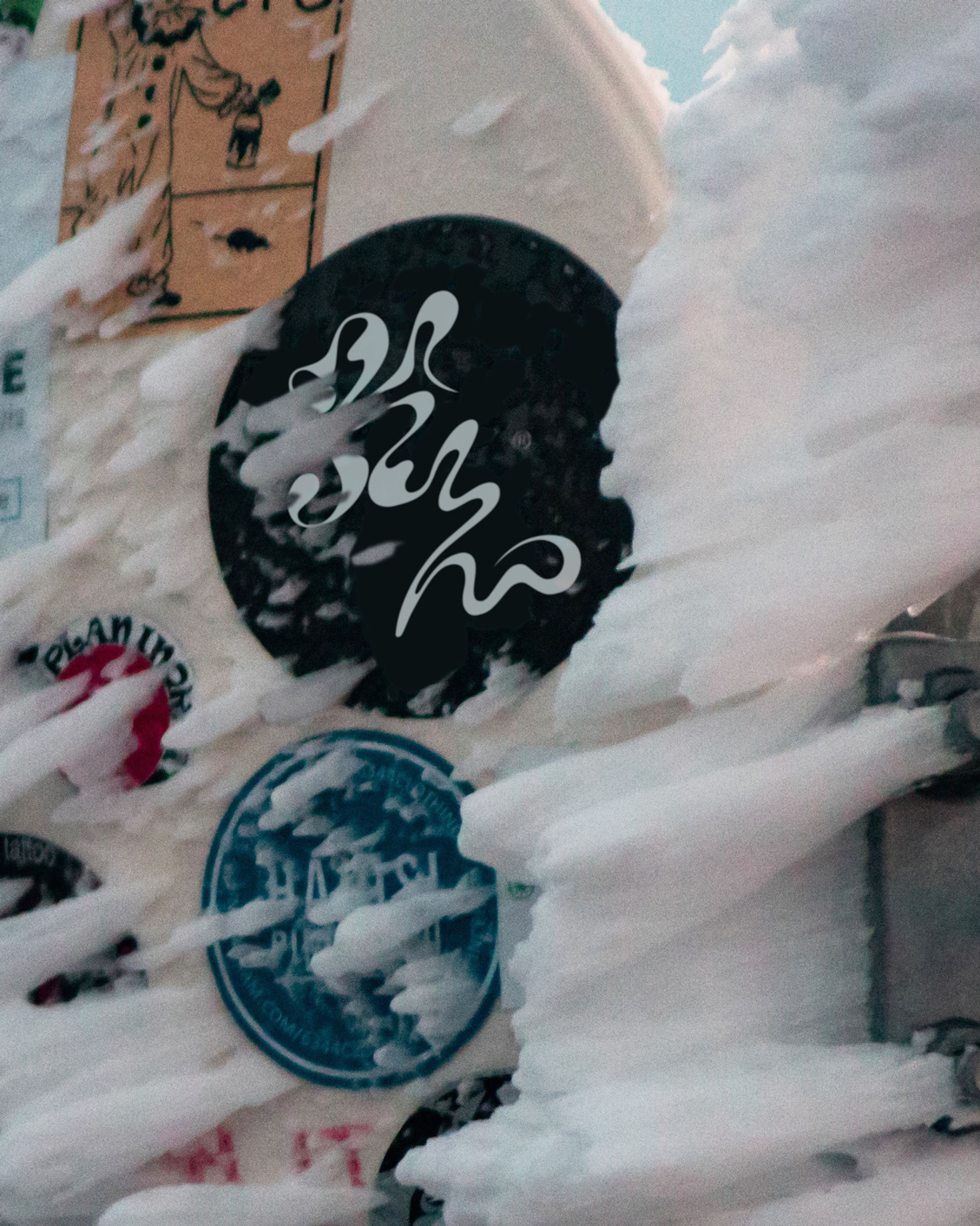
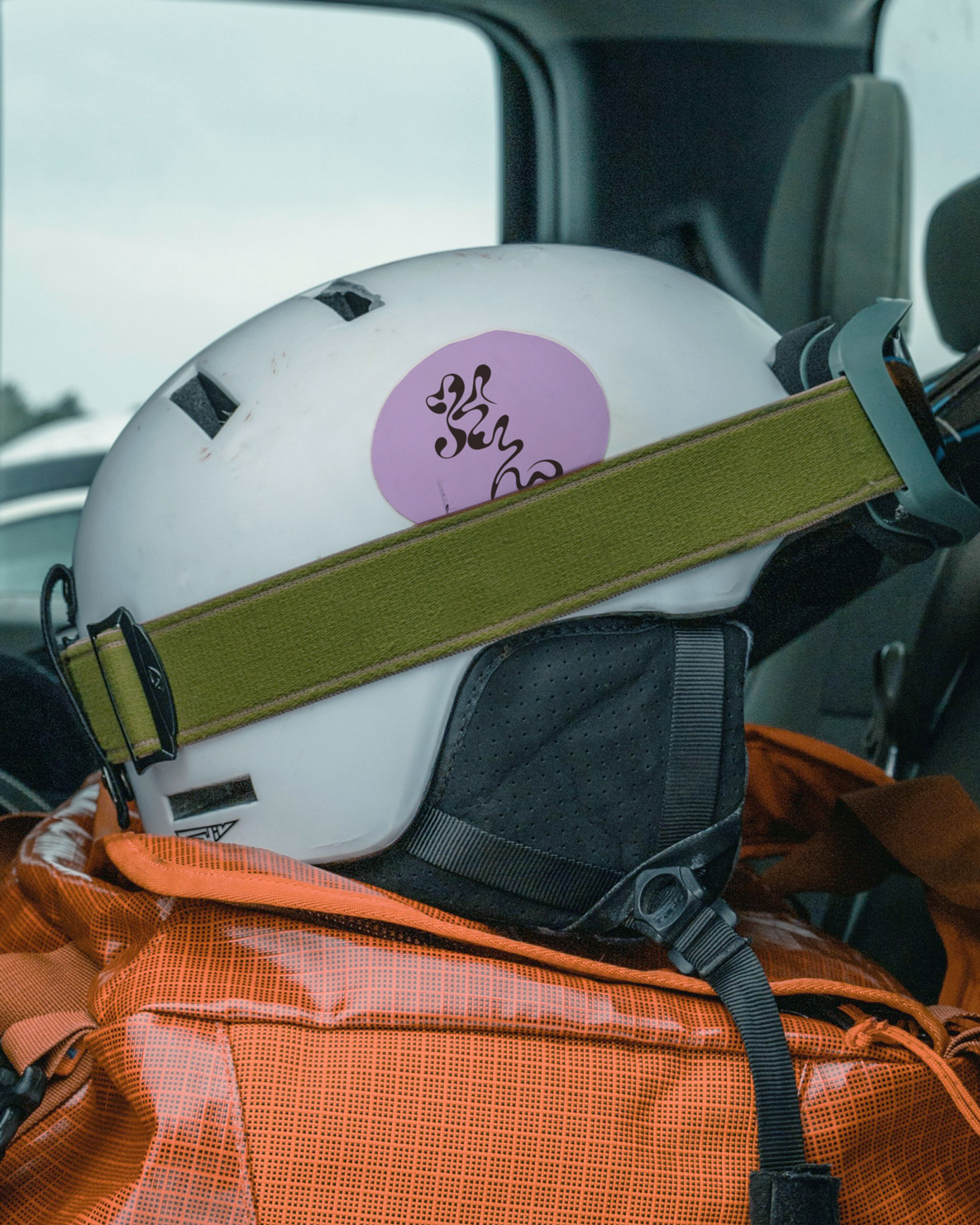
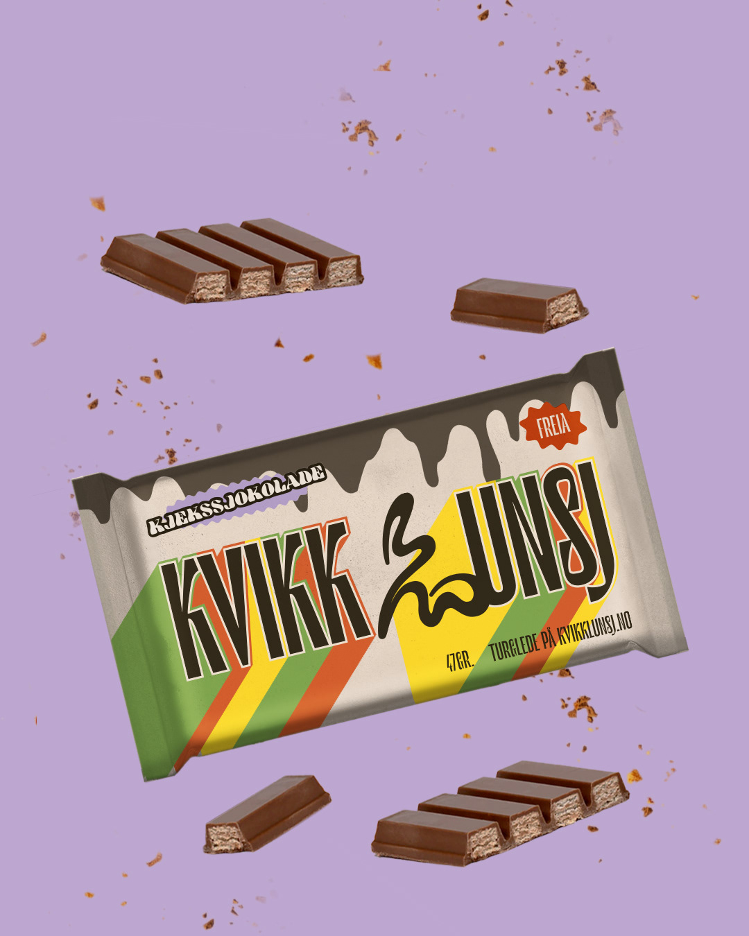
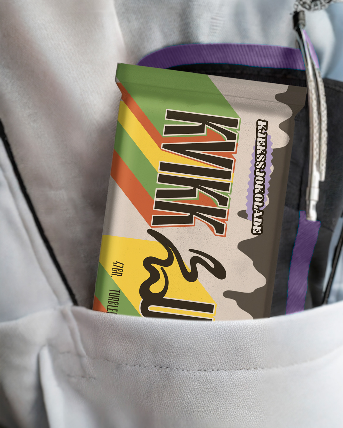
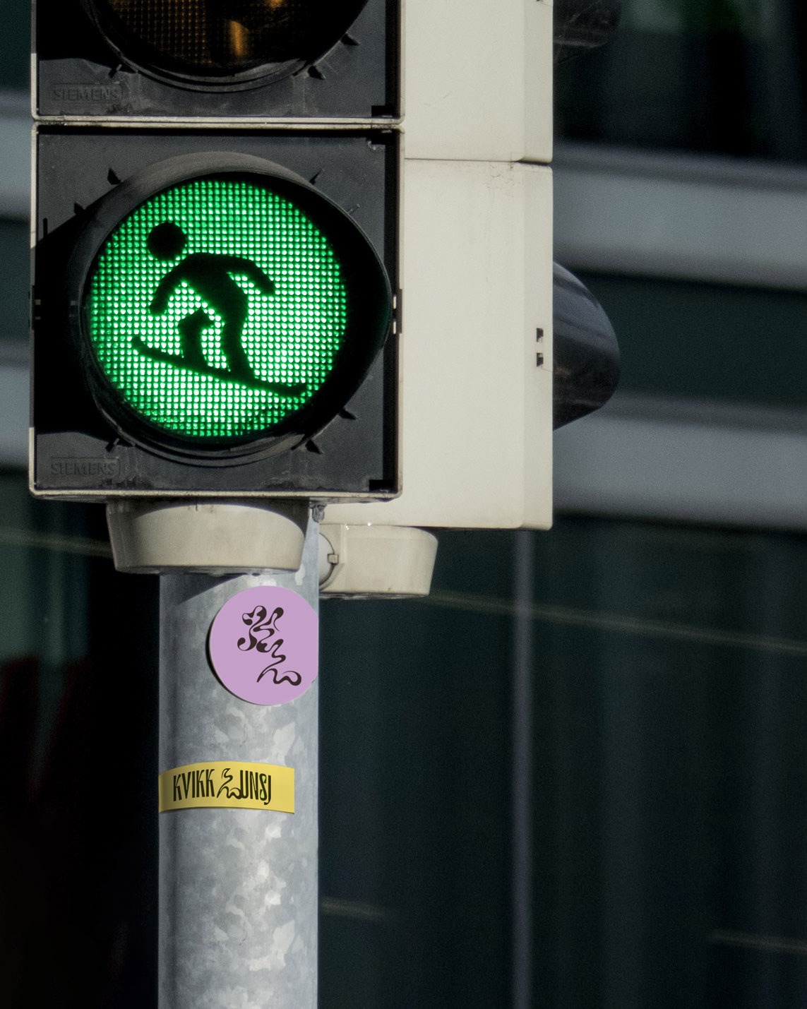
The chosen typographies blend, like a chocolatey jigsaw, the geometric shapes of the snack's long chocolate bars in a design dance with the subtle lines reminiscent of ski carvings. The wiggly traces in the snow are incorporated in the brand graphics enhancing the overall visual narrative.
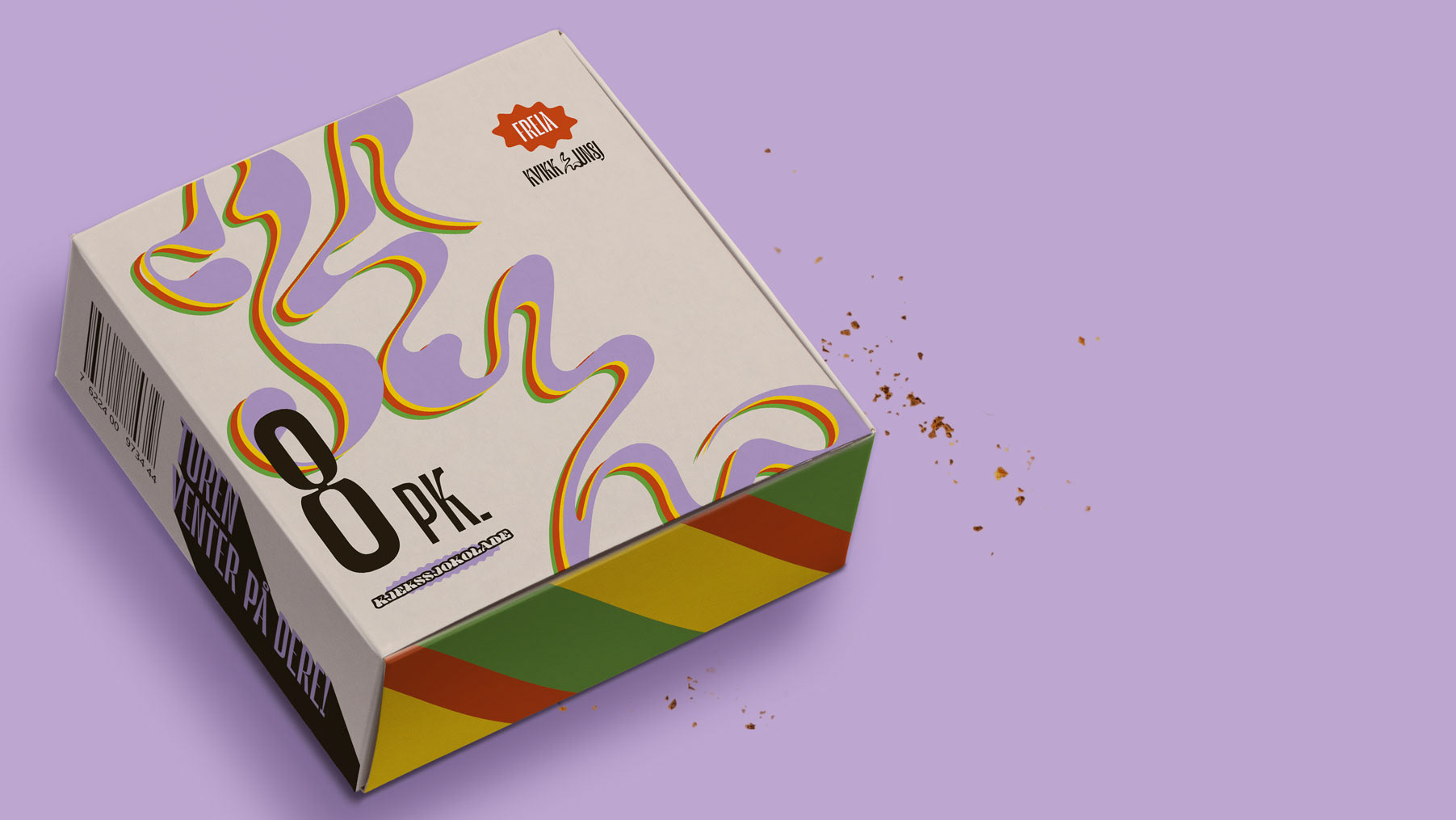
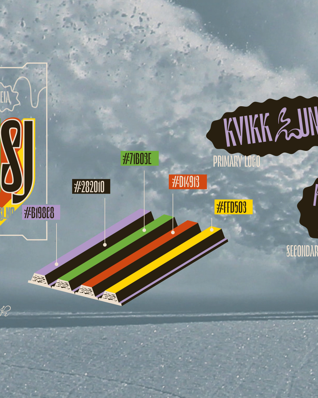
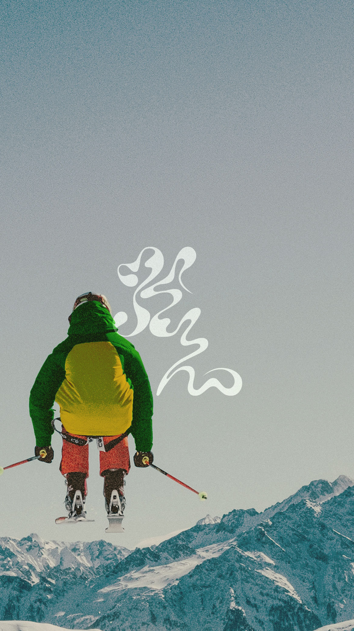
The color palette, a symphony of purple, yellow, red, and green, mirrors the energetic spirit inherent in the KvikkLunsj experience. Each hue serves as a vibrant representation of the joy derived from indulging in this chocolate bar amidst the great outdoors.
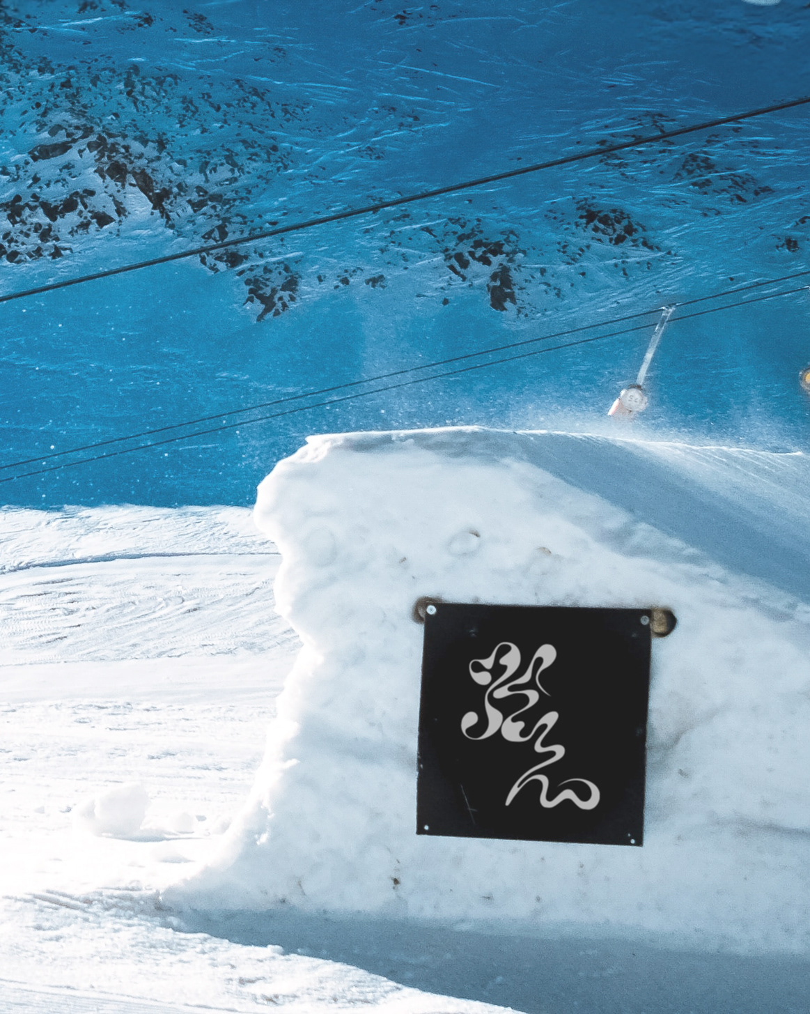
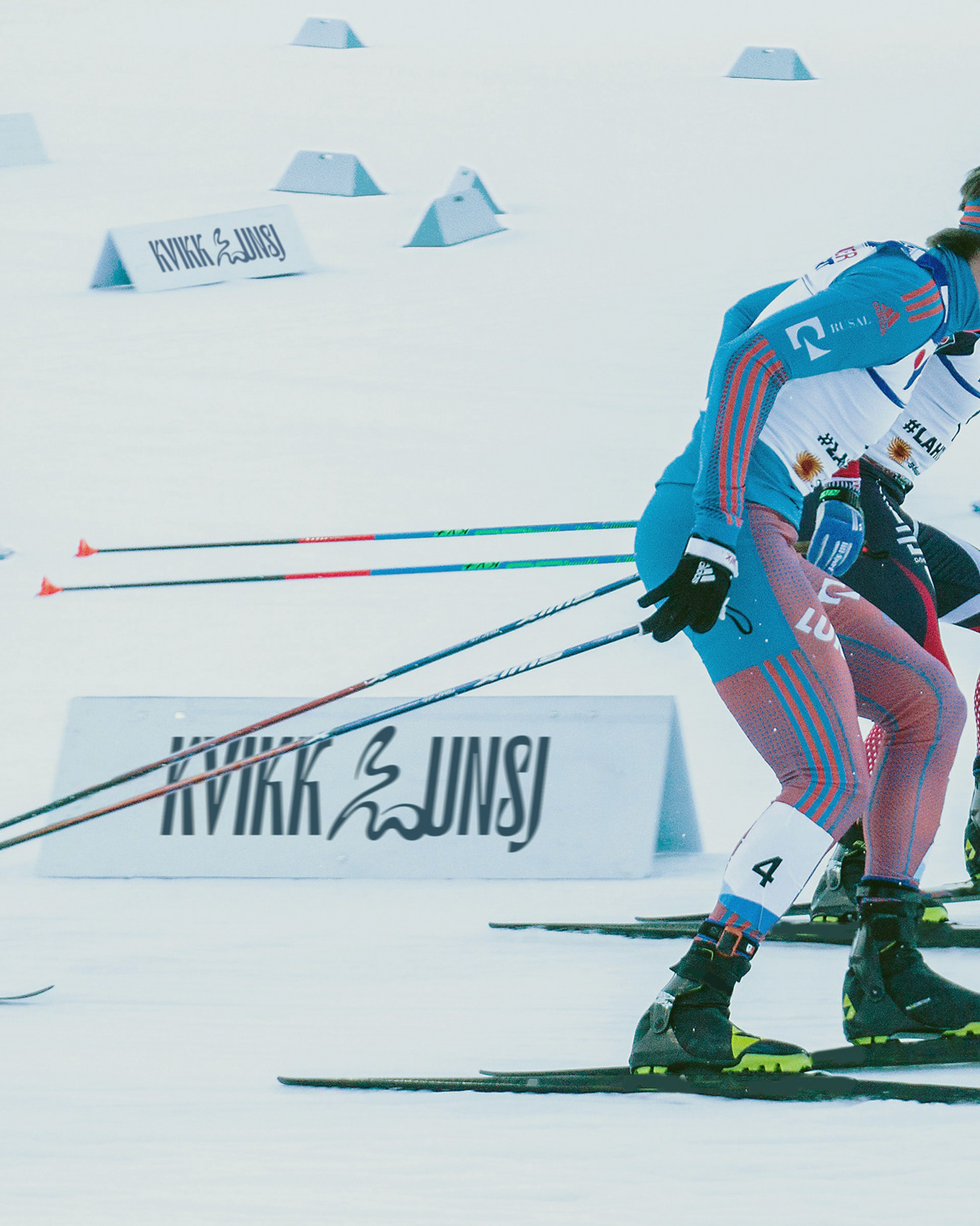
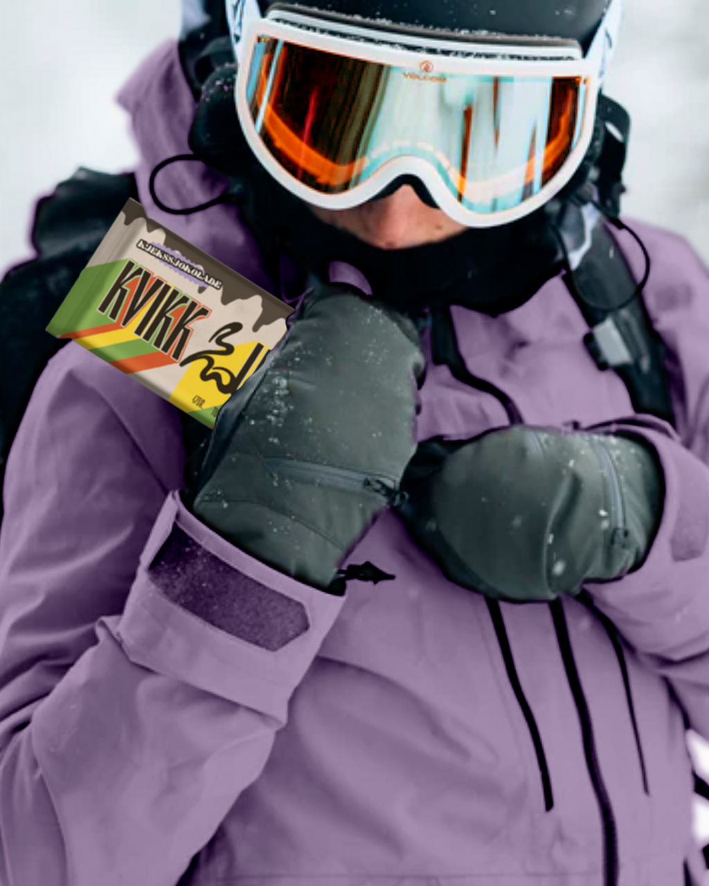
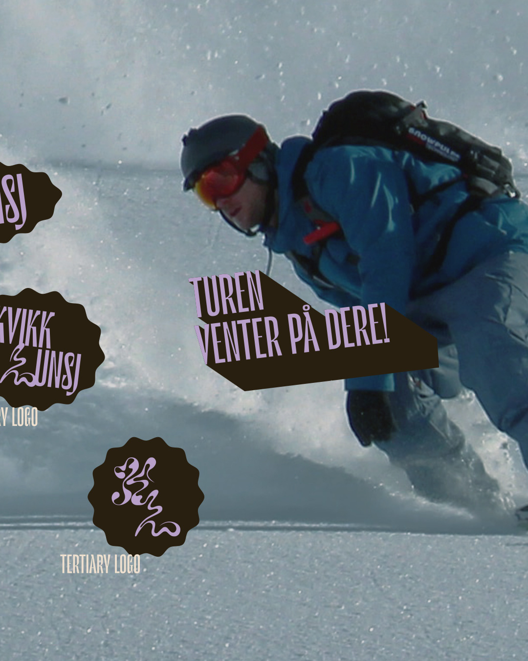
Essentially, the KvikkLunsj makeover merges tradition with an adventurous vibe, enticing folks to relish this tasty treat while soaking up the lively energy that embodies the brand. This graphic design feat is our way of blending visuals and storytelling to celebrate this iconic Norwegian delight.